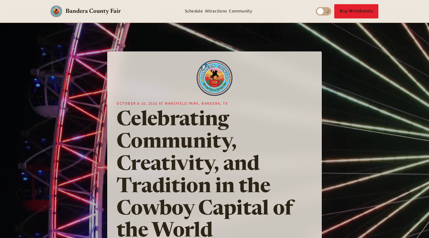
Bandera County Fair — Dusk Hero Redesign Concept Study
Subject: Bandera County Fair (unsolicited concept study)
A speculative redesign of the Bandera County Fair website hero, built as a standalone static mockup with CSS/SVG canyon string lights and a Canvas 2D ferris wheel. Three build stages: skeleton, palette and type, refined final.
Three takes on one direction
I built the fair hero in three passes. Not because I love a process slide, but because I kept asking myself the same question at each one: is this actually right? The answer stopped being a question on the third pass.
Stage 1: Skeleton
Black outlines on a white page. No color, no fonts worth mentioning, just rectangles in the right spots. Before I touched a single hue, I wanted to know one thing: can someone land here and find the when, the where, and the buy button, all without reading carefully?
They could. On desktop, the column sat at 68 characters wide. On a 390px phone, it breathed at 24px insets. Date on top, then the tagline, then the location line, then the wristband button, big enough to tap without squinting. Skeleton passed.
Stage 2: Palette and type
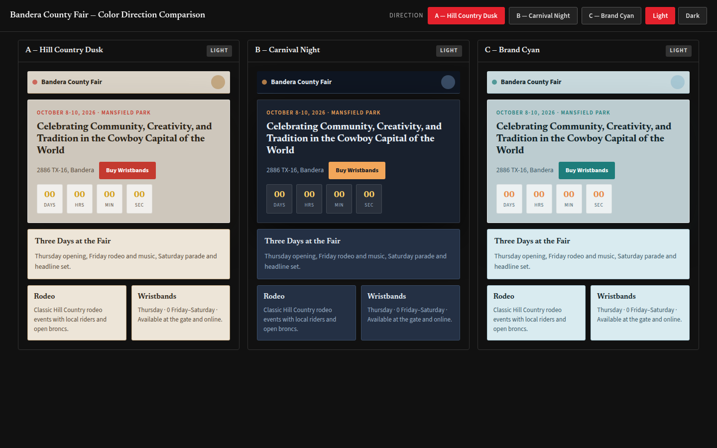
Purple was the first to leave the frame. The real fair doesn't whisper. It leans into barn red, carnival gold, and the dusty earth you actually see in the Hill Country. I pulled Direction A, Bandera Dust, straight from the fair's own logo. Terracotta for the primary, gold for the punch, sand for the quiet behind it, dark earth for the text that needs to be read, not stared at.
Fonts next. Newsreader handled the display copy, a bracket-serif that felt lived-in without being dressed up. Source Sans 3 carried everything else. Simple, slightly boring, highly readable. I like boring fonts on anything that has to communicate fast.
The colors and type dropped onto the skeleton without rearranging a thing. What got cut here: an SVG leather texture I'd slapped behind the hero column. Looked fine on desktop. On mobile, it turned into a muddy smear. I tried to save it, stripped the noise, sharpened the grain, halved the resolution. Still fussy. Gone. Flat surfaces only. The dead-end mockup lives in my scenes folder still, a reminder that not every idea earns its place.
Stage 3: Refined final
This is where the rhythm locked in. I worked to an 8px grid, and the gaps between date, tagline, location, and button settled into 16, 24, 32, 48. Type weights and leading got their final say. The wristband button went full-width on mobile, inline on desktop. Focus rings landed, a 2px outline in the accent color, so keyboard users always know where they are.
The sponsor marquee runs the full roster, not just the big names. The friends-of-the-fair tier usually gets kicked to a secondary page on the real site, but I kept it here. Sponsorship is what makes this thing run. It belongs up front, not tucked in the footer.
No hero photo made the cut. The palette and copy carry the weight. A licensed shot may come later, but only if it passes a 4.5:1 contrast check against the cream overlay. Everything else stays verbatim from the live site. The tagline, the pricing, the urgency copy, all of it. Good design gets out of the way and holds the door.
See the full mockup
The mockup runs standalone. HTML, CSS, and a Canvas 2D ferris wheel that loops, with prefers-reduced-motion support baked in. It is not Three.js. No WebGL, no external scripts, no server. The full interactive version lives at mockups.revcliff.dev/bandera-county-fair/.
See It Live
About This Case Study
Unsolicited concept study for portfolio and educational purposes. Bandera County Fair (unsolicited concept study) did not request, review, or endorse this work.No paid work is being offered or implied. The direction was chosen by the studio without external input.